Friday, 20 November 2009

Questionnaire and results


Questionnaire


What is your favourite type of music?
-Pop
-Rock
-Hip-Hop
-Indie
-Metal
-Classical

What is your favourite colour?
-Red
-Black
-Yellow
-Purple
-Green
-Blue
-Orange
-Pink
-Other

What are your reasons for buying this sort of magazine?
-Entertaining
-Informative
-Interesting

What part of the magazine do you prefer?
-News
-Features
-Interviews
-Exclusives
-Reviews
-Other

How much would you be willing to pay?
-50p-£1
-£1.01 - £2
-£2.01 - £3
-£3.01 - £4
-£4+


I asked 100 people their favourite colour; I believe this will help me in deciding what colour scheme to use on my magazine as I don’t just want the colours I want because the majority of people may not like them. Colour is very important and very conventional to use in a front cover of a magazine, it can catch the readers eye with bright colours, or can have peoples favourite colours on so maybe they will notice it. My results came back that black and red were the most popular colours, I am happy as I think them 2 colours compliment each other very well. Also this is very typical of my genre of music as it is very British oriented and red is very much associated with the union jack, also blue and white may be sued as blue came back the 3rd favourite and white is an easy colour to either use as a bright colour or background colour. I also believe I might use props in my image so if I want to use colourful props then this could give me a good idea on what colours go well together. As I don’t want to be having two colours which don’t go, then my magazine cover will look bad.


This is a chart to show what people prefer in music genre is. I asked 100 people and it came back that Indie was the favourite. This is good as it is also my favourite type of music so I don’t have to adapt much but I will do a lot of research into it. I know a lot of bands and magazines I can look at so I won’t have to waste much time in finding them out, but I can take a look at what clothing, styles, and magazine layouts there are. Rock came back the 2nd choice so maybe I could fit in a bit of rock music to add more variety to the magazine, this will more than likely attract a wider range of people when they are looking at magazines.


This graph shows me what the majority of people prefer in terms of reading a magazine. This will give me an idea so I know what to emphasise on. The results showed me that interviews is the most popular thing, so if I have a main headline as in interview then maybe more people will take notice and read it. Exclusives was also a popular vote so maybe a second story using an exclusive could sell my magazine more, as it adds variety.

Background information on Q magazine

Q is a music magazine published monthly in the United Kingdom, with a circulation of 130,179 as of June 2007.

Founders Mark Ellen and David Hepworth were dismayed by the music press of the time, which they felt was ignoring a generation of older music buyers who were buying CDs — then still a new technology. Q was first published in 1986, setting itself apart from much of the other music press with monthly production and higher standards of photography and printing. In the early years, the magazine was sub-titled "The modern guide to music and more". Originally it was to be called Cue (as in the sense of cueing a record, ready to play), but the name was changed so that it wouldn't be mistaken for a snooker magazine. Another reason, cited in Q's 200th edition, is that a single-letter title would be more prominent on newsstands.

Q are notoriously famous for their own charts, such as ‘the 50 greatest songs of the decade” and “100 bands you have to hear!”

Often, promotional gifts are given away, such as cover-mounted CDs or books. The January, 2006 issue included a free copy of "The Greatest Rock and Pop Miscellany … Ever!".

Every issue of Q has a different message on the spine. Readers then try to work out what the message has to do with the contents of the mag. This practice — known as the "spine line" — has since become commonplace among British lifestyle magazines, including Q's movie-centric sister rag, Empire and the football monthly FourFourTwo.

I believe this is the sort of magazine I want to be modeling myself on, they are a hugely popular music magazine throughout Britain and have been successful for over 3 decades. I will be doing much more research to make sure I know the ins and outs of music magazines to make sure I know just what I need to put on the cover, and what I can expect to find when designing the layout.

different magazine, page and spread


Each of the 3 magazines all follow a trend, they all have a colour scheme to them, they all have the main story in biggest letters and so it stands out. Usually the band or singers name, so when people see it and are a fan of the music, then they will more than likely take note and want a further look. They all have a masthead at the top of the page as it is normal for your eyes to start at the top and work down. Also, the competitions and other stories that have importance are in other bright colours so that you see them to, as they are a great selling point as readers like the opportunity to win things. They also have things at the very top of the page, usually something that the reader can benefit from, or another story to get the reader interested. They all have the title, date, price, barcode, images, stories and contrasting colours. Which all seem to be conventional throughout the magazine industries so it will make sense for me to use all of these when making my magazine. They all have the main story and then more information underneath or round about, but not too much as it makes you read on and inside.


Thursday, 19 November 2009

Questionnaire

I am going to prepare and produce a questionnaire to find out just what I need to know; I believe this will help me decide on what my target audience, will want in terms of a front cover and what they want to see in the magazine. I hope this can give me a good idea on what to include, and how much I can make my magazine.

Tuesday, 17 November 2009

Front page and spread


In each of the front covers the conventional features are evident from just looking at it without having to read anything. In each cover there is the logo in the top left corner, in the same colour, this maintains consistency throughout the magazines and makes it noticeable to each reader as that is the thing they will look for when looking for this magazine. They all have the main image in the middle, with the main headline around the picture somewhere. The colour scheme stays the same throughout each edition, for example in my first example, there is a blue background on the cover, and on the page spread the colour is maintained, and the reference is kept in each edition. On the Green Day one, the colour green is used a lot because of their name. Also the writing is kept within a number of colours. Another selling point is at the top of a few it says ‘the UK’s biggest music magazine’ which makes you think it must be a good magazine to be the biggest seller. Also you can tell what kind of Person/band is on the cover because the colour and how they’re portrayed is evident. For example in the lily Allen one, she is a sexy woman so they have played huge emphasis on that to attract the male gender, whereas on the noel Gallagher one he is portrayed as a kind of hard man so men will aspire to be like him, especially if they are a fan of his music. The main headlines are also the biggest writing on the page, to attract a lot of attention, But it says the band or singers name so if a fan of them notices their name then they are more likely to want to take a look at it.

Sunday, 15 November 2009

a bit on the cover.

For my main task I am going to produce a front cover, contents page, and double page spread for a music magazine. I will be having a main image which may well be a single person or band. For this I need to pay a lot of attention to detail for things such as lighting, clothing, props, camera angle and shot, all these things are key to the way the person is portrayed, for example, if the person is portrayed to be a hard man in real life, then they will be dressed accordingly with maybe chains, rings etc. also the lighting will be using darker colours such as black, as black connotes mystery and evil. The camera angle will maybe be at a low angle shot to show power and intimidation. The camera shot could be a close up, to show real expression on the persons face. Whereas if the person is a girl then she might be portrayed as quite vulnerable and small so the lighting will be lighter as this connotes pure, and good. The camera angle might be at a high angle to show she is small and helpless. The camera shot could be an establishing shot to show once again how small she is in a big place, also it could show she is all alone which is another factor of maybe being scared and helpless.


I could use a variety of camera angles in my image:


  • A high-angle shot makes the subject look small or weak.

  • Low-angle shot makes the subject look powerful or threatening.

  • A neutral shot has little to no psychological effect on the viewer.


i will also be taking into account what shot i will be using:

An extreme long shot contains a large amount of landscape. It is often used at the beginning of a scene or a film to establish general location (setting). This is also known as an establishing shot. I could use this to maybe emphasize loneliness, for example if a band has split up.


A long shot contains landscape but gives the viewer a more specific idea of setting. A long shot may show the viewers the building where the action will take place.


A full shot contains a complete view of the characters. From this shot, viewers can take in the costumes of characters and may also help to demonstrate the relationships between characters. I could use this if maybe 2 people have had a major argument or love.


A mid shot contains the characters or a character from the waist up. From this shot, viewers can see the characters' faces more clearly as well as their interaction with other characters. So if I am wanting two or more people on the cover this could be effective.


A close-up contains just one character's face. This enables viewers to understand the actor's emotions and also allows them to feel empathy for the character. This could be used if my main image is someone who is angry or upset, so the viewer can see just how the person or people feel.


An extreme close-up contains one part of a character's face or other object. This type of shot creates an intense mood and provides interaction between the audience and the viewer. Maybe could use this one to show the audience a real sense of emotion, although I doubt I would use this as it wouldn’t give people much of an idea on what is going on.


Aside from the image, there are a lot of other things on the cover which need to be thought about immensely. Things such as the colour scheme, layout, font, sizes, and all the conventional things really. I believe after a bit more research I will know just what my magazine cover will look like, I am going to be doing plenty of mock drawings and using things to decide what looks best.

Wednesday, 11 November 2009

Clothing


This is Liam Gallagher, the lead singer of Oasis. His clothing give a real look at what indie music artist tend to wear, long coats, baggy jeans, basically a look to say ‘I don’t care’ but when they are actually wearing very expensive clothing. This will help me on my front cover as I am wanting to include someone who fits the bill for an indie type singer, so in order to do so they will have to have the correct clothing, look, and all round feel about them if I am wanting to make it look authentic.


This is ‘The Enemy’ another Indie based band, their clothing is very conventional to what type of clothing I am looking for in my front cover, they are all wearing Black Jackets, baggy jeans and Adidas Trainers. This is very similar to the look I was hoping to have on my front cover. I believe this has helped me tremendously as I now know what kind of look i am wanting and how it fits into the music I am going to do.


Here we have ‘Kasabian’ these are a Manchester based indie band, they are dressed quite smart, which is another way I could go. Indie has a variety of clothing but they all seem to follow a certain trend, long coats, rough looking, and baggy jeans.


Now I know what kind of image I am looking for, I will be taking many draft shots to make sure I get the image right.


A bit of info on Indie music, and the music scene

Indie Music.

In popular music, independent music, often generally abbreviated as "indie", is a term used to describe independence from major commercial record labels and an autonomous, Do-It-Yourself approach to recording and publishing.

Independent labels have been known to strive for minimal influence on the artist they represent, avoiding the artist-cultivating behavior of many major labels. Artists represented by Independent labels have been known to be focused more on producing music than becoming wealthy and/or well known. These Artists use more off beat styles to create music since they are not hindered by the record label.

Indie Music scene

Many different cities have taken to be an ‘indie music scene’ places such as:

  • Yorkshire (Notably Leeds and Sheffield): Sheffield is best known in indie circles for the band Pulp and its front man Jarvis Cocker. Several members of Mercury Prize winners Gomez who hail from Southport, Merseyside, studied at Sheffield University. The rise of Arctic Monkeys has paved the way for new bands such as Milburn, Little Man Tate, The Long Blondes, The Dodgems, Reverend and the Makers and Baby Long Legs. Not as prolific as Sheffield, Leeds has still produced notable indie acts such as Kaiser Chiefs, The Music, Your Vegas, The Cribs, Last Gang, ¡Forward, Russia!, Hadouken! Attended Leeds University although they are originally from Bushey, The Pigeon Detectives and The Wedding Present. These post-millennium bands are associated with the New Yorkshire scene by NME.
  • Manchester: Famous for the Manchester scene in the late 80s led by Factory Records artists James and The Happy Mondays as well as Inspiral Carpets and the hugely influential but radically different Stone Roses who are believed to have set the scene for ‘indie’ music. The Manchester scene heavily influenced the Britpop scene in the 90s which included Oasis, The Verve and Doves this was said to be the ‘golden’ era of indie music as Oasis and the verve have over 20 number 1’s between them. Recent bands to emerge include The Courteeners, The Whip and Nine Black Alps. Singer-songwriters Badly Drawn Boy and Jim Noir operate from the suburb of Charlton. Manchester also had a thriving Punk scene inspired by the famous gig in the Manchester Free Trade Hall by The Sex Pistols. In the audience that night was: the Buzzcocks, Factory Records boss Tony Wilson, and post-punk band Stiff Kittens who would later become Joy Division (and ultimately New Order).
  • London: Notably the ‘The Scene That Celebrates Itself’, Ikara Colt, Thamesbeat, Klaxons, Bloc Party, M.I.A., The Libertines, Babyshambles, Dirty Pretty Things, The Holloways, The Rakes, New Young Pony Club, The Veils and Razorlight. There are many solo indie acts to emerge from London, such as Jamie T, Jack Penate, Lily Allen, Kate Nash and Adele. The noise rock bands PRE, Part Chimp, Shit and Shine are also from London. A notable label from London is Rough Trade Records. Caribou resides in London.

(a lot of the above bullet point took from Wikipedia.org)

Main Task

For my main task I am going to produce a music magazine cover, contents and double page spread. I am going to be taking particular interest in looking at magazines such as ‘Q’ and ‘NME’ as they are aimed at the sort of music I like to listen to.

For my main task, I have to make sure I have spent a long time thinking about what sort of music magazine I am going to do, there are many different genre’s I can chose from such as:

  • Rock
  • Pop
  • Rap
  • R’n’B
  • Indie
  • Classical
  • Metal
  • Techno
  • Jazz

I am going to have to research into each type of genre to make sure I have a good understanding into each one, although I believe I know what kind of music I am going to do, I am going to do Indie. This is because it is my favourite type of music and I also have many ideas in terms of a front cover image and story. I need to have a think about what the conventional features of the indie music scene are, I believe them to be something like:

  • Casually Dressed
  • Rough looking
  • Sex, drugs, smoking
  • Guitars

Indie is very much a British based music scene, which is one of the reasons this music takes a lot if interest to me as I could play a huge emphasis on British culture mixed a lot with the indie music. My target audience is going to be around 16 and over males, as I think the majority of women wouldn’t take to this music as there are hardly any, if any bands/singers that play to this type of music. It is very much a male oriented music scene. Britain is very much famous for his indie music; it has over 10 ‘indie’ cities. This is most notably because of the bands which have come out of those cities. I am going to have to do a lot of research into indie music to improve my knowledge of it so I know exactly what I want to have on the cover. Indie music has many similar types of music, such as ‘house’ and ‘Rock n roll’, I could use them in my magazine as they are probably going to interest my target audience because I predict they aren’t going to be interested in just one type of music. I will need to research many magazines to take a look at a range of images to see what camera shots, lighting, props etc. are used.

NME magazine analysis


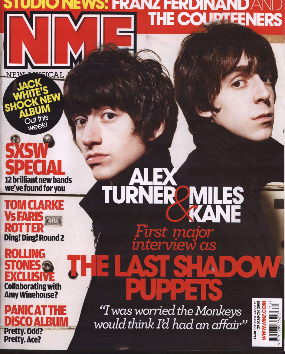
Here I have got a front cover to a music magazine NME.


It is a very conventional front cover, it has a set colour scheme, title, image, main story, puffs, date and price.


The colour scheme is set to within 3 main colours, red, white, and black. This is maintained throughout all the cover so things look in order. The main headline is in the brightest colour and biggest writing which makes it stand out. This is to catch the target audiences eye as they believe it to be the biggest story so they will make more the effort to make sure the readers know exactly what they can expect when they read, although they do leave a lot of mystery as they will want the reader to actually read something, and want to know what the story is about. Also music magazines usually have the band name or singers name on the front also, so the readers will notice that to. Because if they like that certain band or singer then it is more than likely going to catch their eye and get them to take more interest in. Another main conventional feature is the masthead (title), it is on the top of the page because they will want the reader to know who is making the magazine, it doesn’t change in any of the magazine’s, also its normal for a reader to start at the top, and work down so to start with the masthead gives a good starting point to the reader. A good selling point is to have a competition or something along them lines on the cover. This gives the reader a chance to get more than they paid for, also some people enjoy entering competitions as everyone loves to win things. The question is usually something everybody can answer so more people will enter; this is to make more money for the company. This could be a good idea to include on mine as it is conventional also. The puffs also stay in with the colour scheme, these are conventional to just about everyone as there cant just be one story on the front otherwise less people will want to buy the magazine so to include more and more stories will enhance the audience to read on. Many people will notice something on the side stories that is of their interest. The main image is a good representation of the genre of music this magazine promotes and includes. The 2 people have quite long hair and the way they’re stood back to back show they are connected in some way, whether it be through a band or family. They are also wearing black, this connotes a genre of music also, a grunge or indie type music. It also fits nicely in with the colour scheme which im sure the creators have thought about, so I will have to think to.


This magazine has gave me a lot of good ideas for what to put on my front cover, I believe if I research properly and have a thorough look at a variety of different magazines then I will know what to put and have a good idea on how to organise it accordingly.


CD give away


In this magazine they give away a free CD, this could be a good idea for my magazine as the reader will think they are getting more for their money. This is good because then they may go on to buy more magazines, especially if they like the CD. It is quite unconventional to actually give away something, normally you see competitions or chances to win various things, but actually giving the reader something may enhance their decision when looking at a variety of magazines. Just like most other magazines this one follows a colour scheme so its pretty obvious that I will also need to do the same. It also has all the conventional features. so i now have a good idea on what i need to put on the cover.