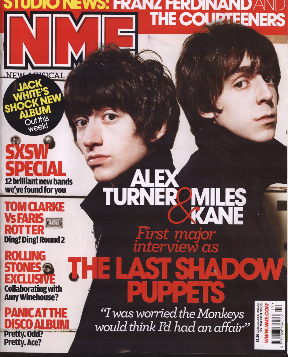
Here I have got a front cover to a music magazine NME.
It is a very conventional front cover, it has a set colour scheme, title, image, main story, puffs, date and price.
The colour scheme is set to within 3 main colours, red, white, and black. This is maintained throughout all the cover so things look in order. The main headline is in the brightest colour and biggest writing which makes it stand out. This is to catch the target audiences eye as they believe it to be the biggest story so they will make more the effort to make sure the readers know exactly what they can expect when they read, although they do leave a lot of mystery as they will want the reader to actually read something, and want to know what the story is about. Also music magazines usually have the band name or singers name on the front also, so the readers will notice that to. Because if they like that certain band or singer then it is more than likely going to catch their eye and get them to take more interest in. Another main conventional feature is the masthead (title), it is on the top of the page because they will want the reader to know who is making the magazine, it doesn’t change in any of the magazine’s, also its normal for a reader to start at the top, and work down so to start with the masthead gives a good starting point to the reader. A good selling point is to have a competition or something along them lines on the cover. This gives the reader a chance to get more than they paid for, also some people enjoy entering competitions as everyone loves to win things. The question is usually something everybody can answer so more people will enter; this is to make more money for the company. This could be a good idea to include on mine as it is conventional also. The puffs also stay in with the colour scheme, these are conventional to just about everyone as there cant just be one story on the front otherwise less people will want to buy the magazine so to include more and more stories will enhance the audience to read on. Many people will notice something on the side stories that is of their interest. The main image is a good representation of the genre of music this magazine promotes and includes. The 2 people have quite long hair and the way they’re stood back to back show they are connected in some way, whether it be through a band or family. They are also wearing black, this connotes a genre of music also, a grunge or indie type music. It also fits nicely in with the colour scheme which im sure the creators have thought about, so I will have to think to.
This magazine has gave me a lot of good ideas for what to put on my front cover, I believe if I research properly and have a thorough look at a variety of different magazines then I will know what to put and have a good idea on how to organise it accordingly.


No comments:
Post a Comment